
TailwindCSS: The magic of building modern interfaces without complications
When we talk about CSS frameworks, most people think of Bootstrap as the first option. But in recent years, TailwindCSS has become the favorite of thousands of developers around the world. Its utility-first philosophy has changed the way we build web interfaces, making design faster, cleaner, and more flexible.
Examples of websites built with TailwindCSS
Tailwind has become the design foundation of projects from large companies and startups. Here are some real examples:
Tailwind UI
– Tailwind’s official premium components library.
Laravel
– The official site of this backend framework uses Tailwind.
Vercel
– Modern deployment platform, with a clean and minimalistic interface built with Tailwind.
Preline UI
– Free component collection built 100% with Tailwind.
How to install TailwindCSS
1. Install via CDN (the quick way)
If you just want to try it or build a prototype, you can use the CDN version with no configuration:
  TailwindCSS CDN


  ¡Hola Tailwind!
👉 Advantage: no installation required.
👉 Disadvantage: you cannot customize the configuration (colors, typography, etc.).
2. Install with NPM (the professional way)
If you want full control over your project, the best option is to install it via NPM:
npm install -D tailwindcss
npx tailwindcss init
This generates the tailwind.config.js file, where you can customize your project.
Then, in your main CSS file (./src/input.css), import Tailwind:
@tailwind base;
@tailwind components;
@tailwind utilities;
Y finalmente, compilas:
npx tailwindcss -i ./src/input.css -o ./dist/output.css --watch
With that, you have Tailwind ready for larger and scalable projects.
Customizing colors with NPM
One of Tailwind’s biggest advantages is that you can define your own color palette in tailwind.config.js:
module.exports = {
  theme: {
    extend: {
      colors: {
        primary:   '#0073aa',
        secondary: '#005177',
        accent:    '#ff6b35',
        success:   '#46b450',
        warning:   '#ffcc00',
        error:     '#e53935',
        info:      '#1e88e5',
      },
    },
  },
}
And then use them in your HTML:
Welcome to my website
Before and after using TailwindCSS
To understand the difference, let’s see how to style a button using traditional CSS vs Tailwind.
🔴 Without Tailwind (traditional CSS)
.btn {
  background-color: #2563eb;
  color: white;
  padding: 10px 20px;
  border-radius: 8px;
  border: none;
  cursor: pointer;
}

.btn:hover {
  background-color: #1d4ed8;
}
🟢 With TailwindCSS
👉 Result: fewer files, fewer custom classes, and everything in one place.
How easy it is to use TailwindCSS
Now that you understand the philosophy, let’s see how powerful it is in action.
📐 Grid and responsive layout
Tailwind has an intuitive grid system.
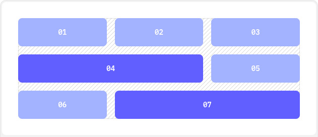
Example: desktop (3 columns) and mobile (1 column):
Column 1Column 2Column 3
👉 Explanation:
grid-cols-1: 1 column on small screensmd:grid-cols-3: 3 columns on medium screens and upgap-4: spacing between columns
📦 Flex as an alternative to grids
When you need simpler layouts or alignments, you can use flex:
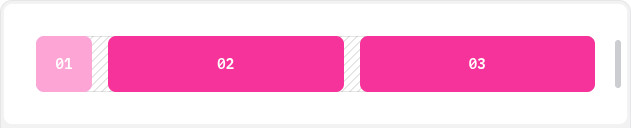
Box 1Box 2Box 3
flex: enables flexbox.space-x-4: horizontal spacing between items.- You can also use
justify-center,items-center,flex-col, etc.
🎨 Colors and shade variations
Tailwind includes a predefined palette with intensities:
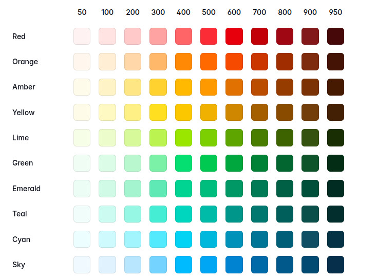
Blue 100Blue 500Blue 900
👉 Suffixes like -100, -500, -900indicate intensity.
📏 Margin and Padding
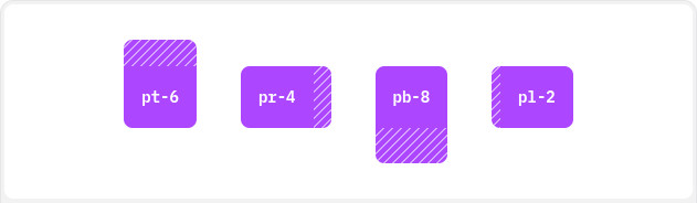
Spacing uses prefix rules:
m-2: margin all aroundmt-4: margin topmb-6: margin bottomml-2/mr-2: left / rightmx-4: horizontal marginmy-4: vertical margin
Same for padding (p, pt,pb, px, py).
Example:
Box with margins and padding
👉 mx-4adds horizontal margin, my-2vertical margin, p-6internal padding.
Clarification: TailwindCSS is only CSS (no JS)
A key difference vs Bootstrap is that Tailwind includes no JavaScript.
- Bootstrap includes interactive components (modals, tooltips, dropdowns) powered by JS
- Tailwind focuses only on visual styling
That means you choose the JS library for interactivity (React, Vue, Alpine.js, etc.).
TailwindCSS v4: what’s new
Although not stable yet, the community is already testing Tailwind v4, and it promises major changes.
✅ Pros
- Faster and lighter: better optimization of generated CSS
- Support for native CSS variables (
--color-primary) - New architecture for easier customization
- Smarter compilation removing more unused classes
⚠️ Cons
- Still experimental
- Some libraries and plugins not yet compatible
- Documentation still improving
👉 Tip: use it only in personal or testing projects — not mission-critical production yet.
Summary
TailwindCSS isn’t just a trend — it’s a modern and practical way to write CSS. Its utility-first philosophy, easy color customization, strong community, and flexibility for responsive projects make it one of the best tools for frontend developers.
And looking forward, with Tailwind v4 on the way, it’s clear this framework will continue to lead the evolution of modern web interface development.
